If you received a link to view this page from a “Thank You” email, after registering for one of my live webinars, you are in the right place! If you roamed in from a google search or was sent this page from a friend, it’s okay, everyone is welcome to enjoy the content on this page, aka transcript from the live presentation. NOTE: Subscribe to receive invites to future webinars.
Welcome – Thank you for joining me – My name is Danna Crawford and I’m also known as Power Selling Mom – quick info about me … I’m an authorized local expert with Constant Contact. I’ve been using their service since 2006 and shortly after that I became a Certified business consultant, trained by eBay after being an active seller on the site since 1997 – With my experience of teaching eBay classes and workshops in partnership with the United States Postal Service, Constant Contact contacted me to go through their certification program and now I do webinars and local workshops on the topic of social media and email marketing – Next I became the Development Director for our local Foodbank after a meeting with the board while I was teaching them about fundraising using Constant Contact and eBay, next thing you know they offered me a part time job that I couldn’t resist since I’m passionate about the Cause of feeding America – So those are the three hats I wear, Constant Contact, eBay and First Step Food Bank, Inc. ! You can learn more about me by visiting my website at PowerSellingMom.com or just google my name. NOW, enough about me, lets talk about YOU … and how you can gain more opens, clicks and views on your future email messages.
GROW WITH CONSTANT CONTACT
Let me take just a minute to explain what Constant Contact is for those that may not be familiar.
Constant Contact is a do-it-yourself online marketing system. You can use it to create and manage campaigns. The company is best known for its email marketing tools. It’s easy to create and send mass email, like newsletters or announcements and updates. You can run special promotions or offers; you can build online surveys and polls to gather feedback; and you can promote and manage your events using Constant Contact with registration tools, payment acceptance, invitations– all in one place.
All of this is all built on top of a really good contact database, so that you can load all of your contacts, your customers, stakeholders, volunteers, staff, your board – whatever lists you are keeping in various spreadsheets or in your Outlook, Gmail or Yahoo folders can be loaded and organized easily in Constant Contact so that your people and your marketing campaigns are all together in one spot. Oh, and it costs most people between $20 – $75 a month to manage all of it.
First impressions matter. And when someone opens your email, what they see is going to determine what they do next. Chances are you’ll want them to read your newsletters or announcements, and take a next step. Maybe you want them to visit your website, register for an event, donate to your nonprofit, or try a new product. This is where a beautiful, professional-looking email designed to drive action is crucial. People make snap judgments about whether or not to read your emails based on a quick glance. We choose an email message, give it a two-second glance, then decide if it’s worth our time. If it is, we keep it and read it. If not, we hit the delete key and send the email to the trash folder.
That’s why we created a webinar dedicated to helping you make the right impression. We’ll take you through the reasons email subscribers delete emails and how you can design emails that actually work.
I want to show you the difference between a regular email from your own Outlook, Gmail or Yahoo account, and one sent through an email service provider like Constant Contact.
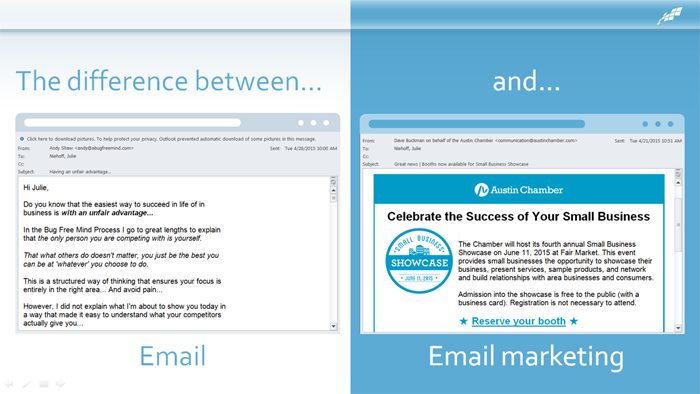
An email from a service provider looks better and gets you noticed – you can use templates to feature your brand’s logo and colors, and include graphics that will capture your readers’ attention. You will get through to your audience. You can use an email service provider to track everything – from who opened your email to how many people clicked on every link. And it allows your recipients to opt out of receiving future messages.
And let’s not forget about the importance of mobile on email. 64% of adults own smartphones and… more than 51% of emails are opened on a mobile device. (source) In some countries, mobile internet usage is even out-pacing desktop internet usage. 64% of American adults own a smartphone . (source) And 52% of mobile owners send or receive email with their device. (source)
So what does this mean for you? Many people are reading their messages – which include your emails – on a tiny screen. And your emails need to look as good in their hands as they do on their desktops.
When you’re creating emails, think about your mobile users. If something doesn’t look good on mobile – readers will delete it.
80% of people will delete an email that doesn’t look good on mobile, and even worse, 30% will unsubscribe if the email doesn’t look good.
Before you send out any email campaign, make sure you send a preview to yourself, so you can make sure it looks good both on a desktop AND a mobile device!
Today, we are going to discuss seven don’ts of email design, and provide you with guidance on how to avoid them.
The 7 Don’ts of Email Design:
- 1.Don’t forget your branding
- 2.Don’t use hard-t0-read fonts
- 3.Don’t use the wrong colors
- 4.Don’t be disorganized
- 5.Don’t forget images
- 6.Don’t forget to make it shareable
- 7.Don’t ignore mobile
- Don’t Forget Your Branding
Your emails should feature an instantly-recognizable, consistent header image such as a logo or a cover photo?. Over time, this image will be associated with the high-quality information you share. Ideally, this email header should relate to the business or product your reader signed up to learn more about.
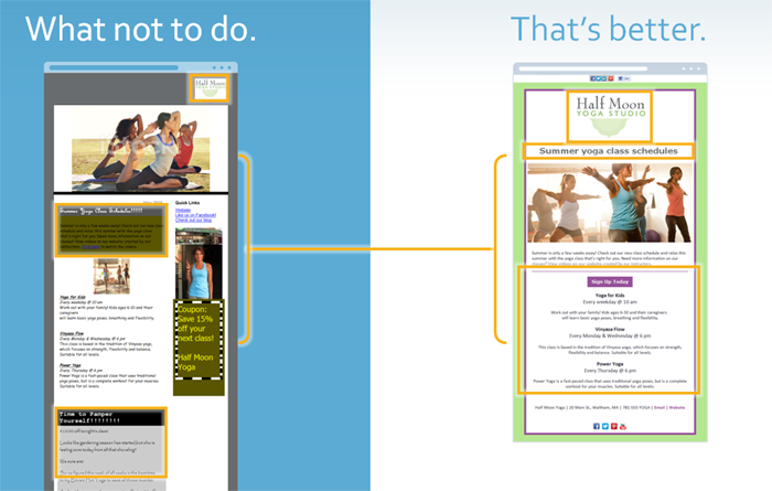
So, if you own a yoga studio, your newsletter should be visually related to your overall brand, including your logo. That way, your recipients will know that even specialized information is coming from you, a source they know and trust.
The yoga studio’s email on the left uses a logo, but it’s small and doesn’t stand out right away. They also don’t have branding colors that compliment their logo.
This email on the right is a makeover of the one on the left. The logo is large and in the center of the email template. You can easily see the yoga studio’s branding right away when opening this email with their logo, colors and images.
Just like you, the people who read your emails are very busy. So how do you win the battle of priorities and get more people to stop and open your email – or read your Facebook posts and tweets, or share your pin on Pinterest? Think about how you prioritize your own email – or, if you’re on Facebook, think about your newsfeed – you pay close attention to who the message is from.
WHO an email or social media post came from turns out to be the most important part of winning the battle of priorities. So it’s important for you to be recognizable.
You do need to exercise care and consider how you’re identifying yourself across the channels you’re using. Just be sure that you’re consistent with the name you use, your logo, your colors, and images while sending email and posting to social media – and ensure that you’ll be recognized visually, so that ultimately your readers and followers will stop and open your email, read your posts – because they know they’re going to get something of value and relevance from you.
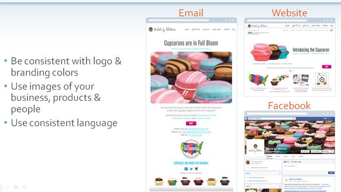
In your email, make sure you’re consistently using your logo and the colors that you use in the rest of your marketing, so that you’re immediately recognizable.
Use great images of your business, products and people, so that your audience can easily connect what your organization does with who you are. We’ll talk more about images in a little bit.
And make sure you use consistent language across all of your marketing so that people will not be confused.
For example, Baked by Melissa does a great job of being consistent with their logo and images across their email, website and Facebook page.
Don’t be afraid to use the same content and images across your email, website and social media posts – the more your organization meets your audience where they are, the more likely your audience is to keep you in mind.
2.Don’t use hard-to-read fonts
Next, we’re going to talk about selecting the right font for your email.
When you’re designing images, think carefully about the fonts that you use. The type you choose can influence thought and behavior. It can support or distract from your message. Your message should be the star, and if it’s cluttered up, or worse, non-legible, because of your choice in font, your message will be lost on your audience.
Another consideration when choosing a font is Serif vs. Sans Serif. Serif fonts are considered to be more traditional and are identified by the small “hooks”
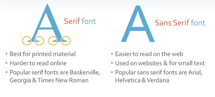
or “curls” at the end of each letter. These are called “Serifs.” Fonts that do not have these are called Sans Serif. Serif fonts are best used in printed material, such as newspapers and books.
When you’re creating content that will be seen online, use Sans Serif fonts because they are easier to read than serif fonts. Try using common fonts such as Arial, Helvetica or Verdana. These fonts are highly legible and compatible with many other less standard fonts.
Choose something that is easy to read and harmonious with the font you use for your brand.
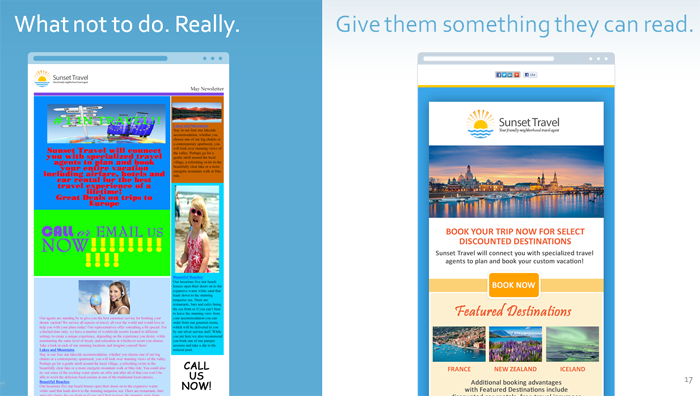
Let’s take a look at some examples. On the left (above), we see a newsletter that has inconsistent fonts, hard-to-read color combinations, poor contrast between fonts and their background colors, text over an image rendering it illegible, too much body copy, poorly sized and positioned images – while the one on the right is quite the opposite. Which one would you rather see in your inbox?
If you use an email service provider like Constant Contact, there are templates you can customize to fit your brand and create clean, easy-to-read emails.
Now let’s talk about the colors you will use in your email.
3) Don’t Use The Wrong Colors!
For your email to look professional and inviting, you have to master color. The biggest color mistakes are choosing ones that are overly bright or florescent. Don’t use too many colors, either. Use a palette with two dominant colors and tone down the rest. Finally, don’t use light text on a dark background. The most readable combination is dark text on a light background.

Let’s compare the emails on the screen (above). The email on the left has too many colors and they’re not branded or complimentary. The email on the right does a much better job with color. It uses a color palette based on the logo, and has some white space so you can clearly read the text in the email.
Color is a key consideration for your visual content. Color catches your audience’s attention and boosts their engagement. Studies have shown that different colors create different emotional responses AND influence customer reactions.
- 85% of shoppers say color is the primary reason they buy a product.
- Color also increases brand recognition by up to a whopping 80%.
- It’s not an accident that major social networks such as Facebook, Twitter and LinkedIn use blue as their primary color. Blue happens to be the favorite color of 40% of people worldwide.
Favorite colors can vary by gender, age, region and culture. They can affect moods or feelings and although there may be cultural variations, some colors share universal perceptions, such as red as a “warm” color and blue as “cold” color. Impulse shoppers tend to respond to red, black and royal blue, while navy blue appeals to shoppers on a budget. (Source: June Campbell, https://www.nightcats.com/samples/colour.html)
Source: Loyalty Square, https://loyaltysquare.com/impact_of_color.php
It’s not an accident that major social networks such as Facebook, Twitter and Skype use blue as their primary color. Blue happens to be the favorite color of 40% of people worldwide.
Why Colors are Important for Your Branding?
Colors spark emotion: Read more at: https://www.customlogocases.com/blog/choosing-brand-colors/
Other Color Resources
- How to Use Color in Your Social Media Strategy https://www.mediabistro.com/alltwitter/social-media-colors-images_b56184
- How Different Colors are Convincing You to Buy Things https://www.businessinsider.com/emotional-effects-of-color-2014-1
- How to Increase Pinterest Engagement by 275% https://blog.hubspot.com/marketing/pinterest-revenue-infographic
- The Meaning of Color in Marketing https://visual.ly/meaning-colour-marketing
- The Anatomy of the Perfect Social Media Post https://60secondmarketer.com/blog/2013/10/29/infographic-anatomy-perfect-social-media-post/?utm_source=feedly
- The Role of Color in Marketing https://www.business2community.com/marketing/the-role-of-color-in-marketing-2-0581222#!bwtUav
- *Source: University of Loyola, Maryland studyhttps://www.businessinsider.com/emotional-effects-of-color-2014-1
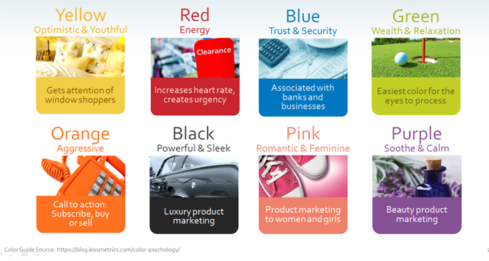
This color guide (above) can help you decide if one of these colors might be best for your content. You can use this to think about what colors to use in your photos or image designs.
Think about your target audience and use the colors that appeal to that audience. Think about the action you want your audience to take, consider which social networks you are targeting, and choose colors that are the right fit.
When applying color to your design, you should consider color choices that work well together, compliment your brand and project the kind of feeling you are trying to convey. It’s important your message isn’t lost and you reach your readers looking your best. What colors you choose and how you use them can make the difference between looking professional or being marked as SPAM. Some things to watch out for are:
- Extremely bright color combinations. It doesn’t matter how many, it doesn’t matter which ones. Using combinations or large areas of intense, pure color is never a good idea. While you may think it will “catch attention”, bright colors are hard to look at, your message will not be read and your email will inevitably end up in the trash. Save the bright colors for small areas, such as buttons or call-to-action elements.
- Bright, textured backgrounds. These will distract your readers from your content. They will compete with all the other, far more important aspects of your email and your message will be lost. If you use background textures, they should be subtle, set back and second place to any of your other content.
- Too much of anything isn’t good, including colors. Too many colors makes your design “busy” and hard to look at. Try to keep your main palette to no more than 3 colors.
- Contrast, especially between your text and the background, is important. Light text or objects on a light background will be lost, as will dark text on a dark background. Keep your message clear and defined by making sure it shows up.
- Avoid using color combinations such as red and blue, red and gray, green and red and any other color combinations that are hard to read. Focusing on such color combinations is difficult for the human eye and the content will appear to “wiggle”, causing eye strain. Avoid using black, blue, red, ANY neon colors for background color choices for the same reasons.
- Choose colors that are harmonious, reflect your brand and easy on the eyes. Use contrast when placing text against a color, to ensure your message can be easily read.
Color can impact whether or not your email is read or rejected, but did you know that color can also impact whether it even makes it into your customer’s inbox? Just as there are key words that will send an email directly to your SPAM folder, over-use of certain colors can also send your emails to the SPAM folder. For example, extensive use of red in text is considered one of the main “tip offs”*. Red is considered to be a loud color and when it is used excessively in text, it appears it is trying to get the reader’s attention. Since SPAM filters work on a scoring system, and this contributes to the overall score, it furthers the chance that your emails will end up as SPAM. Unfortunately, there are no ways to really know exactly which culprits trigger SPAM filters, but following these basic color theory practices should help keep you in the clear.(sourse: https://www.mailjet.com/blog/psychology-of-colors-in-email-marketing/
Colors are an effective way to make an email instantly identifiable as being from your organization. In our email editor you can easily use your own colors or create your own color scheme.
There are a handful of free tools that can help you match colors by determining their RGB value or their hex value – two kinds of codes that will help you identify and use a specific color.
Color Cop, for PC users, and Digital Color Meter for those on Macs have a color value identifier tool that will allow you to pull an exact color from your website to use in your marketing material. When you go to select the colors for your email, a provider like Constant Contact will allow you to enter the exact values so your colors are perfect matches.
Tools like Color Schemer Online and Adobe Color CC can take you even further, by creating a palette of complementary colors around that primary color.
Color Cop (PC) https://download.cnet.com/Color-Cop/3000-2383_4-10047009.html
Digital Color Meter (Mac): Applications>Utilities>Digital Color Meter
Color Schemer Online: https://www.colorschemer.com/online.html
Now, we’re going to talk about how to use templates to organize your content.
4.Don’t be disorganized.
When a reader glances at your email, they should know right away which information is the most important, what they should look at next, and what’s the least important.
Make this easy for your readers by using large, bold headlines for newsletter’s main topics, but also by using the right template to organize your message. Be sure to pick a template that’s mobile friendly so smartphone readers can easily navigate through your information.
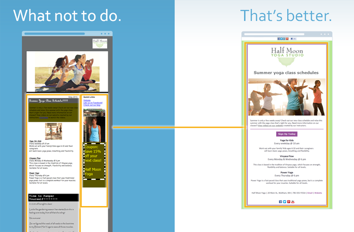
The email you see (above) on the left is not the best fit for the information in their monthly newsletter. It’s also not very mobile friendly because of the column on the right hand side. A single-column template works better for mobile users.
The email on the right uses a well-organized template designed for a monthly newsletter and it’s a one-column mobile friendly template.
This is a list of the types of email campaigns you can send using an email service provider.
- Newsletter
- Announcement
- Product promotion
- Fundraiser
- Sale
- Event
- Seasonal
- Letter
You should select a template that is appropriate for the message you are sending. After you’ve picked out a template, you can then customize with colors it to match your brand, as we talked about earlier.
Templates make the process of creating and sending emails much easier, while still allowing you to preserve the look and feel of your brand. Here are some examples of how different businesses and a nonprofit use the right email templates for their messages.
A quick note before we take a look at these emails: Now that we’ve talked about a few design best practices, you might notice that not all of these examples follow every best practice we’re going to cover today. What I want you to focus on when you look at these emails is how they’ve used templates that reflect the type of communication they’re sending to their audiences.
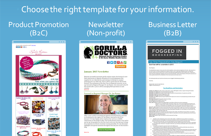
First we have Spoilt Rotten Beads (above). They’re a bead and craft store that sells their products online. They use product promotion email templates that allow them to display different items for sale, and images of each of the items are linked to their website. When you click on the products in the email, you can go online and purchase them right away.
2nd email above is email is from a nonprofit, Gorilla Doctors. They send regular emails that include news and information about the organization and fundraising efforts. Gorilla Doctors consistently uses a newsletter template to organize the information they want to share with subscribers.
Third email above is from a business to business, Fogged In Bookkeeping. They used a business letter template when sending out information about tax deadlines to their email lists.
You can start with the right template for your message and be sure to make it your own with your own logos and photos and links. It doesn’t have to be hard to look professional and sharp!
We will talk about images in a minute, but for now, just take note of the balance of images and text in these examples.
Now, we’re going to talk about images – the photos, graphics and video you may use in your email campaign.
5. Don’t Forget The Images.
When I talk about images here, I don’t just mean photography! Images can be graphics, video, photos and word images (like a funny or inspirational quote over a photo background).
You want your images to reflect your brand and look professional. The good news is that most smart phones and digital cameras now shoot very high-quality photos and video, so you don’t need a ton of technical know-how or extra money to create great images by yourself.
Don’t use low-quality images or stock photos that look overly staged.
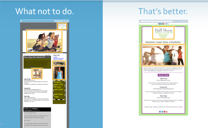
Look at the images in the email on the left (above). They are professional quality, but the top image has a watermark from a stock photography site. The middle image of the yoga class is too small and it’s stretched out. And the images on the right side are very small and hard to see.
The email on the right has a professional image that’s large enough to see and it does a great job of visualizing the email’s message about yoga classes.
Why are images so important?
- Images receive a lot of engagement from your audience. 82% of people pay more attention to emails that have images.
If you need people to do ONE THING, you should consider using a still photo rather than a video, to keep people focused on the physical, measurable result you’re trying to achieve.
- You also shouldn’t over-rely on images to get your message across – many email providers, as a default setting, do not automatically show image. You should label your images with text that explains what the image is, in case it doesn’t display. And take advantage of preheader text – the first few lines of an email or the text description of the first image at the top – that will appear if images don’t on a desktop. This text also shows up below the subject line in the inboxes of mobile readers.
- A few words of caution, though. I mentioned earlier that you should limit your images – emails with 3 or fewer images get the best click-throughs.
- So – what kind of images should you use? Think about what you’re trying to communicate. If you sell products, you should show people what you want them to purchase by using great photos. If you’re a non-profit, you could share photos of your last event or fundraiser. If you’re a B2B, you may want to highlight your employees in action with some good candid photos from your business.
- Because not all email providers allow images by default, you shouldn’t use images of your content. What I mean by this is that you should not use a .PDF instead of your email marketing templates – not only will your content not display for many readers, you will not be able to track any clicks to help you strategize for future email campaigns.
Source: 82% of people pay more attention to emails with pictures https://www.contentlead.com/content-marketing-tips/infographic-anatomy-email-marketing-message
Source: 3 or fewer images for highest click through Source: Constant Contact Data Reveals Direct Correlation Between Email Campaign Effectiveness and Number of Images and Text Lines Featured, 2015)
Photos are a frequent and necessary piece for visual content. Sometimes, you may find you need a photo that you do not have or cannot create on your own. There are a variety of online stock photo sites where you can search for just the right photo that fits your needs. They are a great resource and can work well for visual content that’s based around a theme, a tip, a fact or a quote.
When you download a photo, be sure it is the right size or slightly larger! You can always crop it or scale it down, but will lose image quality if you try to enlarge it too much. Remember, you want your image size to be at LEAST, whatever your final image will be. Photos in a one column email template will display at most 600 pixels wide and 200 pixels high for the header image. All other photos in an email will display at most 600 pixels wide, with the height to scale.
It might be tempting, but it’s never a good idea to use just any image you may find through a search, including sample stock photos with the watermark on them.
There can be copyright issues associated with those images; they belong to someone else. When using stock photos, you purchase the rights to use the photo, or in some cases accept a free download and agree to certain credit/conditions. Fees can vary, so shop around for what feels right for you and fits your budget. Here are some services that you can use to get free stock photos!
- FreeDigitalPhotos.net https://www.freedigitalphotos.net/
- StockVault.net https://www.stockvault.net/
- FreeImages.com https://www.freeimages.com/
Copyright infographic – Can I Use That Picture? https://thevisualcommunicationguy.com/wp-content/uploads/2014/07/Infographic_CanIUseThatPicture.jpg
CTCT FAQ on image size https://knowledgebase.constantcontact.com/articles/KnowledgeBase/5558?q=photo+size&l=en_US&fs=Search&pnx=1
If you’re a Constant Contact customer, one more tool to find stock photos is available in your Constant Contact account. You have access to free and paid images in your account’s image library through our partner, Bigstock. Purchase images or select free images and add them directly to your account for use in your marketing.
Now, we’re going to talk about making your email shareable across your social media platforms.
6.Don’t forget to make it shareable.
I’m betting that you’ve received an email that includes buttons with the logos for one or more social media platforms, which invite you to click and share the email content through your social media accounts.
This is a really effective way you can grow your reach – emails that include those social sharing buttons increase click-through rates by more than 150 percent!
They also make it easy for your readers to follow you on the various social networks in a single click.
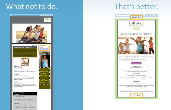
Our email on the left is not shareable (see above). There aren’t any buttons that allow readers to share this email on social media. And, although they did try with a text link on the top for their Facebook page, there are no buttons for readers to click on to follow the yoga studio.
The other email is absolutely shareable, and includes buttons that the audience can use to share it on their Facebook, Twitter and LinkedIn profiles, as well as buttons at the bottom of the message that they can click on to follow the yoga studio on its social networks.
SOURCE: Visualistan, Latest Social Media Statistics Infographic https://www.visualistan.com/2015/04/latest-social-media-statistics-infographic.html
Encourage your audience to share your promotions by using social media tools. This is a really effective way you can grow your reach – emails that include those social sharing buttons increase click-through rates by more than 150 percent!
- If you are using Constant Contact, add the Share Bar to the top of your emails – allows your readers to post a link to your email on their social media profiles
- Remind your audience to share your promotions – ask them to Like it on Facebook, retweet on Twitter or pin on Pinterest
- And add social media buttons that link to your business’ social media profiles. The buttons are a nice visual reminder for them to click and follow you online.
Your audience has a lot of influence via word of mouth, and you can get your promotions in front of more people – their friends and family – if they help spread the word for you
SOURCE: Visualistan, Latest Social Media Statistics Infographic https://www.visualistan.com/2015/04/latest-social-media-statistics-infographic.html
Extend the reach of your emails by using the Social Share tool. Social Share offers a quick and easy way to share an email on Facebook, Twitter and LinkedIn with suggested post messages, images, and the best times to schedule posts based on when your social audience is most active. It also makes it easy to plan social posts for an email with a monthly calendar.
- Schedule your Facebook posts in advance, and then Social Share will post to Facebook for you.
Now, we’re going to talk about mobile considerations for your email design.
7. Don’t Ignore Mobile.
Let’s go through some tips to help you make your email look great on a mobile device – something you need to do, because 80% of users will delete an email that doesn’t look good on mobile.
Think about it – do you want to read long and complex messages on your phone? When you’re on the go? No. Which means neither do your customers or supporters. Do you want to read a message like the one on the left? Probably not.
What you want is to see something more like the email on the right: the result of some basic considerations as you build your message.
Start to re-think your content. Long-form content (think newsletters that have more than a couple of short, to-the-point paragraphs) doesn’t work for mobile readers. So look at the content you’re building and start to re-think it. Could it be condensed? Can a picture tell the story better? Can you turn one newsletter into a series by cutting it into pieces?
If you have longer, or more complex content or assets you want to share (like a product guide, or new regulations for your clients or a research report that supporters of your non-profit would be interested in), send an email with a clear call-to-action with a link that directs people to where that asset lives on your website, blog or other resources.
Most of the time you’re going to build emails on your desktop. There are some dos and don’ts to keep in mind in order to make those emails mobile friendly. Let’s see some of those tips I just mentioned in action.
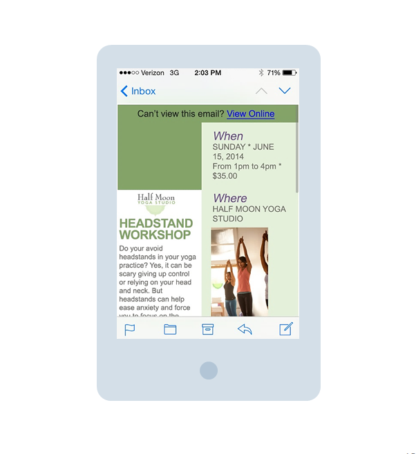
Look at the bottom of this first email (see above) – it’s cut off.
- Avoid using too much text. People don’t take the time to scroll through a long email. The shorter the better. That goes for your articles and subject lines – both can get cut off by a mobile device if they’re too long.
- Avoid tiny fonts. They’re hard to read and people may not take the time to zoom in and view your entire message.
- Avoid multiple columns because they can get cut off or they might shrink to fit, as in this next example. Either way makes your message unreadable.
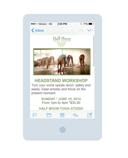
This email is a great makeover of the don’ts (shown above). You can see that there’s not a lot of text, just enough to get the most important information across. The fonts are large and easy to read. No zooming is needed to view this message. It has a single column – nothing’s getting cut off and everything fits within the phone screen.
We talked about images earlier, and there are some things you should consider with images when you’re thinking about mobile. Images are a great way to tell your story and engage your audience, but they can be distracting and cause your audience to ignore or delete your message if they don’t look good on a mobile phone. Avoid using large images that will get cut off on a mobile screen. Test your emails, and if the images are too big, resize them.
Avoid these mistakes:
- Large, off-screen images
- Hard-to-find or hard-to-read calls-to-action
Think about your calls to action. Make them easy to read and put them in the top section of your email so people will notice and take that next step. Don’t make people hunt, zoom or scroll.
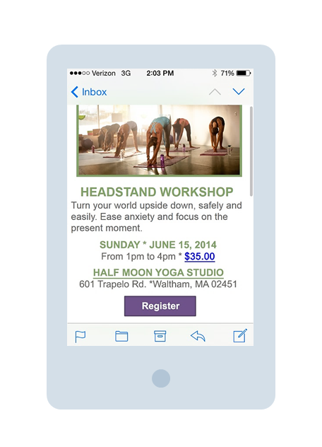
Your images should be sized to fit a mobile screen – this photo above isn’t cut off and doesn’t take up the entire screen. Also use clear and easy calls to action. In this email, the message is short and sweet. It’s about an event – all the info is right there and a register button is at the bottom. People can decide instantly if this is something they want to do, and take the action right away.
How can you create an email that looks great on mobile? Try building it on your phone! If it works for your phone, it will look great on your customers’ phones.
There are lots of apps that make it easy to build an email with your smartphone. Constant Contact does have an email creation app for your iPhone or Android phone. You can find it by going to the app store and searching for Constant Contact. Apps are more convenient and faster than creating campaigns from your desktop.
You can create your email through touch-based editing right from your mobile device. Then preview your email, send tests and schedule messages for delivery to your list. You also have the ability to keep up with the latest activity with open and click reporting right from your phone. Keep track of who engaged with your campaign and stay on top of your marketing results.
We just covered a lot of information today about email design. What should you do next with it?
We’ve made it easy for you. We took the best practices we talked about, as well as some pro tips and created a checklist. Print this out later on when you get the slides, and use this checklist when you’re designing and sending your next email.
- First of all, think about the preview pane. It’s common for email recipients to use the preview pane in their inbox on a desktop, and they’re getting their first look at your email there. If they’re opening your email on mobile, the top section is the first section they see. Maximize the top 2 to 4 inches, keeping all the best practices in mind that we covered today.
- The email template you use must be a good fit for the information you’re sharing in your message. What are you trying to communicate? Is it information in a newsletter? A product promotion? A business letter? The right template will organize what you’re trying to convey and make you look professional. The template should also be mobile friendly. Stick to a one-column template that won’t shrink to fit or get cut off by a smartphone screen.
- Make sure your branding is visible right away. Include your branding colors. Your logo should be visible at the top of the email, either on the left or in the center. Never on the right side because it can get cut off on a smartphone screen. When you insert your logo, make sure that you include your business name in the text description. Sometimes images aren’t visible by default, based on the recipient’s email service. If that happens, the text will appear instead, and you want your business name to be what they see if your logo isn’t shown.
- Speaking of logos and images, make them clickable. People assume that images are linked to a website, so take advantage of that behavior and link your images to allow readers to take the next step. Choose your photos wisely, and don’t overdo it with images. We’ve found that emails with 3 or fewer images will get higher click-throughs from subscribers. Communicate your message through the images you choose. Take your own photos or use stock photography. Size your photos to fit your template. Optimize them by including information about your message in the text description, so it will appear in case the images aren’t automatically downloaded.
- Be selective with the content you include in your email. Don’t include any content that isn’t relevant to the message you’re sending in an individual email. Most people do not have the time to read through a lot of extra information. In fact, a recent study we did of our customers showed that emails with 20 lines of text received high click-through rates.
- If you have calls to action – like asking people to purchase something, register for an event, take advantage of a sale or coupon, or read an article on your blog – make sure they are above the preview pane scroll line and appear near the top of the screen on a mobile device. Don’t make people search for that key action. Be mindful of the links you use for those calls to action. Don’t just put “click here” when it comes to links in an email. Choose the words you use carefully. Clearly state the value your readers will get when they click on the link. Format your link to stand out, remember that you want it to have enough white space around it and make sure links aren’t on top of one another. More and more people are viewing emails on their mobile device, and if they are unable to click the link they want because it’s too close to another, how likely do you think they are to go back and click the correct link?
- Don’t ignore social media in your emails. Make them shareable for your readers and for you. Including a share bar at the top of the email allows your readers to post a link to their email to their social media profiles. Adding social media buttons that are linked to your business’ social media networks can increase your followers because it makes it easy for readers to click and like you. Using the Social Share tools to schedule posts about your email on Facebook, Twitter and LinkedIn enables you to share your message to even more people.
Now you have everything you need to design an email that looks great in the inbox. You’ll get noticed, and your readers will love receiving your messages. Your emails will help to grow your relationships with your current customers, gain new customers and drive more business.
Emails with three or fewer images and approximately 20 lines of text result in the highest click-through rates from email subscribers. SOURCE: Constant Contact Data Reveals Direct Correlation between Email Campaign Effectiveness and Number of Images and Text Lines Featured https://news.constantcontact.com/research/constant-contact-data-reveals-direct-correlation-between-email-campaign-effectiveness-and-n
Exclusive Offer for Today’s Participants!
Be a Marketer with Constant Contact!
FREE 60 DAY TRIAL or Skip the trial and allow me to help you become a better marketer by using the power of Constant Contact.
ALREADY USING CONSTANT CONTACT? Become a part of the “PowerSellingMom Network” and together we can jump on a webinar for some one-on-one assistance. Just send me an email to: dannacrawford@gmail.com with a note saying” Yes, I want to be a part of the PowerSellingMom network and learn with her about Constant Contact. Include your Constant Contact user name and I will send you an alert when ready. Next well schedule ‘a phone call and jump on a webinar.


Sure email me at: powersellingmom@gmail.com
Hey!
I hope you’re well. I’m reaching out to you to help monetize your blog.
I run outreach campaigns for select clients who pay for links in existing articles on blogs/sites such as yours.
If you’re willing to place a link in one of your existing articles then simply reply to this email.
I have high-end clients who are willing to pay per every link placed.
Regards,
Michelle Higson.